
Although digital design once depended heavily on exact pixel measurements, today’s diverse device ecosystem demands approaches that naturally adapt to various screen sizes, resolutions, and user behaviors. Pixel-free design responds to this need by advocating dynamic measurement methods, user-centric scaling, and adaptive interface principles.As the digital environment becomes more complex, understanding Pxless offers designers a path toward creating interfaces that feel natural to users regardless of device. Additionally, it fosters better performance, enhances usability, and ensures design systems remain future-proof as technology continues to advance.
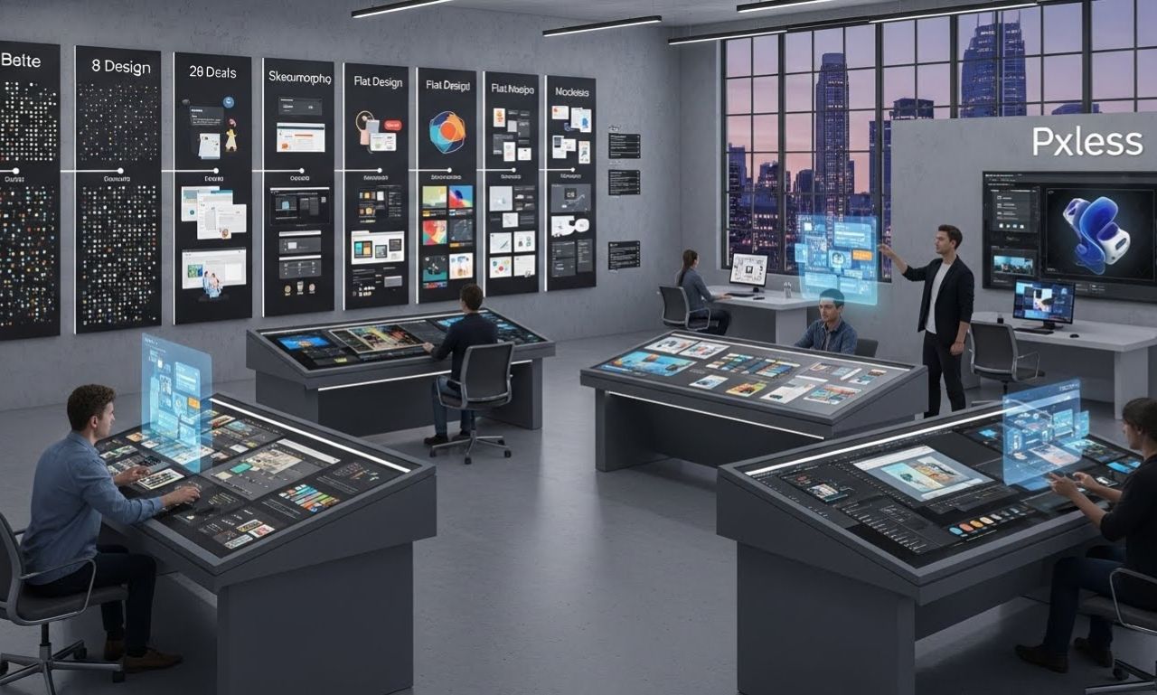
Understanding Pxless as a Modern Design Philosophy
Pxless refers to a design approach that moves away from fixed pixel units and instead embraces fluid measurements such as percentages, viewport-based units, flexible grids, and scalable typography systems. While it does not eliminate precision, it places emphasis on relative sizing rather than strict values.
The concept emerged from the frustration many designers faced when their pixel-perfect layouts appeared distorted or broken across devices with varying screen densities. As displays evolved from low-resolution monitors to Retina and ultra-HD panels, designers needed a more adaptable solution. Pixel-free design, therefore, is not just a technique—it is a mindset that reshapes how interfaces should look and respond.
This ideology encourages:
-
Fluidity instead of rigidity
-
Scalability instead of static sizing
-
Accessibility rather than fixed designs
-
Consistency across platforms instead of device-specific layouts
As digital experiences expand to smartwatches, tablets, AR headsets, and interactive screens, Pxless gives creators the structure needed to maintain consistency and aesthetic integrity.
Why Pxless Matters in Today’s Multi-Device Environment
Digital ecosystems no longer revolve around desktops alone. Instead, users interact through mobile devices, smart displays, wearable tech, automotive screens, and even virtual environments. Moreover, each platform has unique screen dimensions, resolutions, and interaction patterns. As a result, a pixel-perfect design often fails to scale appropriately, causing interface misalignments and accessibility issues.
Pxless solves these challenges by offering:
1. Enhanced Responsiveness
Fluid measurement units automatically adjust components to fit various viewport dimensions. Designers no longer need separate layouts for each device category.
2. High-Resolution Compatibility
Modern screens have extremely high pixel densities. Pixel-free design ensures designs remain crisp and proportional regardless of resolution.
3. Better Accessibility Adjustments
Users can increase font size or interface scale without breaking layout structure. This supports inclusivity across visual abilities.
4. Simplified Maintenance
A Pxless design system reduces redundant work, as elements adapt automatically—saving time for both designers and developers.
5. Future-Proofing
As new device types emerge, flexible design foundations ensure the interface remains consistent without complete redesigns.
Overall, adopting Pxless provides long-term benefits for any digital platform focused on delivering seamless user experiences.
Core Principles Behind Pxless
To fully utilize Pxless, creators should understand its foundational concepts. These principles describe how the philosophy operates and why it leads to more adaptable design ecosystems.
1. Fluid Layout Structures
Instead of using static pixel widths, Pixel-free design relies on percentages and flexible grids. This allows containers and elements to reorganize based on device width.
2. Scalable Typography Systems
Pxless encourages designers to adopt units like rem, em, and vw instead of fixed pixel typography. As a result, the type automatically adjusts based on the root size or viewport, ensuring a more flexible and responsive text experience.
3. Relative Spacing and Proportions
In addition, margins, padding, and spacing adapt proportionally, allowing layouts to remain visually balanced. Therefore, the visual hierarchy stays intact across different devices and screen sizes.
4. Component-Driven Consistency
Moreover, reusable components—such as cards, buttons, and navigation elements—remove guesswork during design and development. Consequently, their styles scale automatically based on pre-set rules, maintaining uniformity throughout the interface.
5. User-Centric Adaptation
Instead of forcing fixed values, Pixel-free design allows users to control zoom, text scaling, and accessibility preferences without breaking layout integrity.
These principles collectively transform how designers approach modern interface creation.
Practical Implementation of Pxless in Digital Projects
Applying Pxless requires understanding the tools and methods that support flexible design. Designers and developers often incorporate the following systems:
1. CSS Units
-
remandemfor typography -
vwandvhfor viewport responsiveness -
%for scalable containers -
frfor grid layouts
2. Fluid Typography Techniques
Methods like clamp() allow smooth scaling of text between minimum and maximum sizes.
3. Responsive Grid Systems
Modern frameworks such as CSS Grid and Flexbox support Pixel-free design principles without extra complexity.
4. Component Libraries
User Experience Improvements Through Pxless
One of the biggest advantages of Pxless is its direct impact on user satisfaction. Moreover, having an interface that adjusts effortlessly creates an intuitive and enjoyable experience.
1. Consistent Visual Structure
Users receive predictable UI behavior regardless of device type, improving navigation familiarity.
2. Better Content Legibility
Scalable typography ensures reading comfort on both large and small screens.
3. Reduced Interaction Errors
Responsive spacing and proportional touch targets minimize accidental clicks.
4. Customization Options
Users can increase zoom levels or font sizes based on personal preference without breaking layout design.
These improvements enhance accessibility, engagement, and overall usability.
Challenges of Adopting Pxless
While Pxless offers many benefits, its implementation also requires adaptation.
1. Learning Curve for Designers
Those accustomed to pixel-perfect buffers must shift thinking toward flexible layouts.
2. More Testing Across Devices of Pxless
Since Pxless adapts dynamically, designers must test multiple breakpoints and screen behaviors.
3. Complex Component Behavior of Pxless
Ensuring components scale proportionally can sometimes require advanced CSS strategies.
4. Branding Consistency Concerns
Some brands worry flexible layouts may affect strict identity guidelines, though careful design systems resolve this.
Despite these challenges, most teams find that Pixel-free design significantly improves workflow in the long run.
Future Outlook of Pxless in the Digital World
Future developments may include:
-
Automated Pxless systems integrated into design tools
-
AI-generated adaptive components
-
Advanced viewport sensing technologies
-
Universal scaling standards across operating systems
As digital experiences expand, Pxless will serve as a foundational approach for future-ready interface design.
FAQs about Pxless
1. What does Pxless mean in digital design?
Pxless refers to a flexible design approach that avoids fixed pixel measurements and prioritizes scalable, adaptive layout structures.
2. Does Pxless eliminate precision in design?
No. It retains precision while shifting measurement methods to relative units that scale naturally.
3. Why is Pxless important for modern devices?
It ensures designs appear consistent across high-density screens, foldable devices, tablets, wearables, and traditional desktops.
4. Is Pxless suitable for beginners?
Yes. Although it requires a mindset shift, modern tools and frameworks make Pixel-free design easy to implement.
5. Can Pxless improve accessibility?
Absolutely. It supports user-controlled scaling and ensures layouts remain intact at different zoom levels.
Conclusion
Pxless stands as a forward-thinking design philosophy that transforms how creators build digital interfaces. Moreover, instead of relying on pixel-fixed methods, it embraces fluidity, scalability, and user-first adaptability. Furthermore, as device ecosystems continue to diversify, pixel-free design provides the framework necessary for consistent, accessible, and future-proof digital experiences. Consequently, by understanding its principles and adopting flexible measurement techniques, designers and developers can confidently shape the next generation of responsive interfaces.