
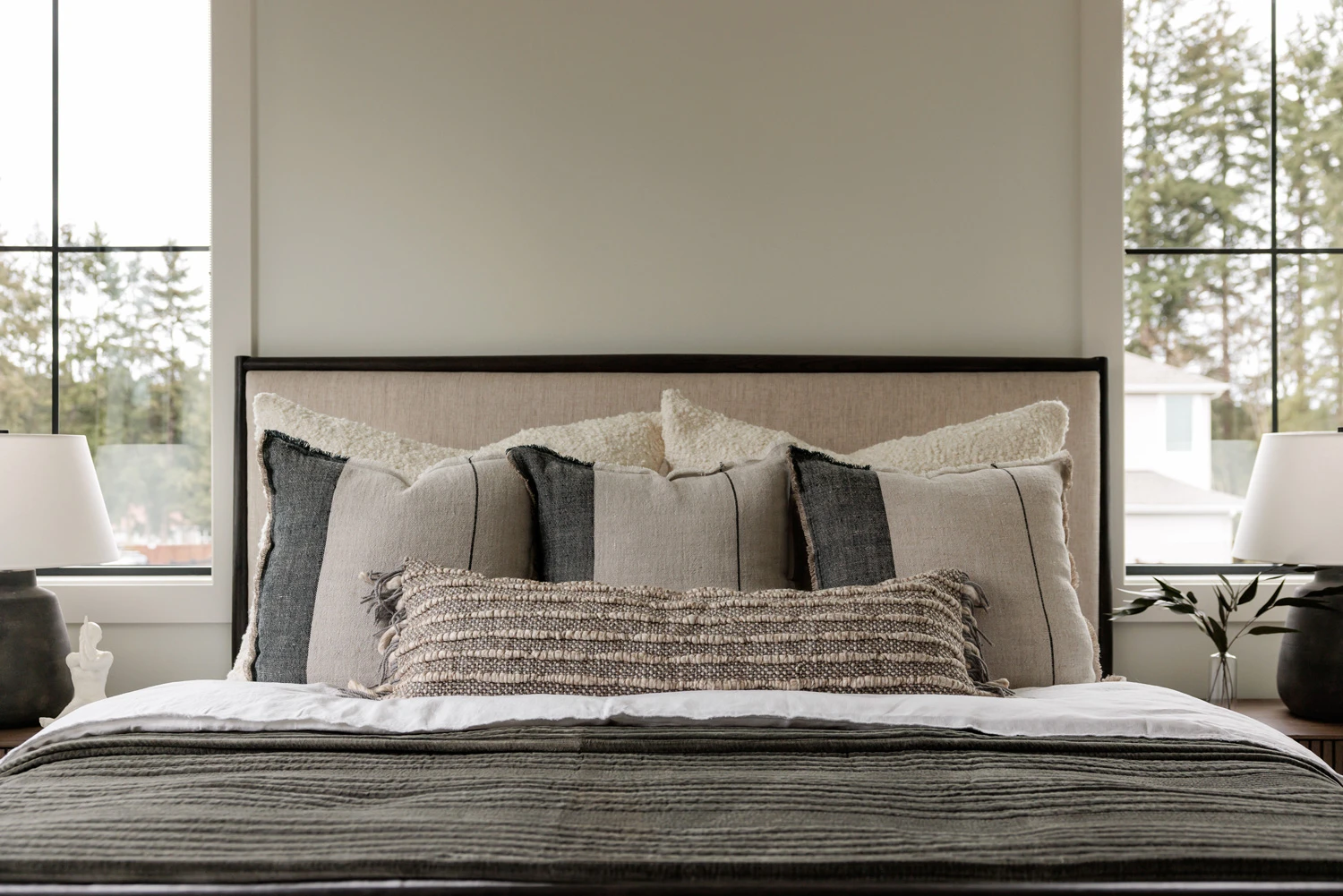
A spare room can be a perfectly useful place to make creative work, even when it does not look like a studio. The difficulty appears when an otherwise strong photograph includes distracting furniture, uneven light or a background that does not fit the intended project. Editing can help, but it works best when the original image gives the process something reliable to build on.
AI photo workflows offer ways to explore new environments, refine distracting areas and develop a more deliberate visual treatment. They do not turn every weak source photograph into a convincing finished image. Focus, perspective and the relationship between the subject and the light still matter.
Start by separating capture problems from design choices. A distracting room may be replaceable, but a blurred subject or badly clipped hair can be difficult to recover. Decide what must remain faithful to the original photograph and what the new setting is allowed to change before attempting an edit.
Capture a source image that is easy to work with
Begin by reducing avoidable problems at the camera stage. Place the subject where it receives clear, reasonably even light. A simple window setup can provide a useful starting point, provided the contrast is not so extreme that important details disappear into shadow or bright areas.
Keep the camera steady and check focus at the subject’s most important point. For a portrait, that is often the eyes. For a product, it may be a label, edge or surface detail that needs to remain recognizable. A sharp source gives you more room to judge the effects of later editing.
Move unnecessary objects out of the frame when practical. Removing a chair before taking the photograph is often easier than repairing the space around it later. AI editing is valuable, but it should not become a reason to ignore simple improvements that make the entire workflow more predictable.
Choose a studio direction before replacing the room
A studio look is not one visual style. It can mean a plain background with soft light, a dramatic fashion setup, a carefully arranged product scene or a textured editorial environment. Choose the direction that fits the subject and the purpose of the image.
Write down the intended mood, palette and level of realism. For a creator’s profile portrait, a restrained backdrop may communicate more clearly than an elaborate imaginary location. For a conceptual album image, a more theatrical treatment might be appropriate. The background should support the message rather than demonstrate every available effect.
Develop a small concept board using your own references or material you are authorized to use. Identify what each reference contributes: light direction, texture, color or composition. Avoid collecting unrelated images simply because they look impressive. A coherent direction is easier to translate into edits.
Preserve the subject’s identity and defining details
Before editing, list the elements that should remain unchanged. In a portrait, that could include facial features, hairstyle, clothing and expression. In a product image, it may include shape, branding, material and scale. This list becomes your review guide.
Do not assume a generated revision preserves every detail outside the requested change. Inspect the result closely, especially around edges and intricate features. A more polished image is not automatically a more accurate one. If the subject’s identity matters, compare against the original throughout the process.
For a real person, agree on the intended use and the degree of alteration. A creative portrait can explore an unusual environment without silently changing the person’s appearance. Clear expectations make it easier to decide which edits are appropriate and which move the image beyond the purpose of the shoot.
Match the background to the existing light
The source photograph already contains information about lighting. Shadows under the chin, highlights on a product and reflections in glasses all suggest where the light came from. A replacement background should make those clues feel plausible.
If the subject has soft side light, consider a studio environment that supports that direction. A new background showing strong sunlight from the opposite side will create a visual contradiction. The mismatch may be subtle, but it can make the image feel artificial even when the edges are carefully handled.
Treat lighting changes conservatively. It is possible to explore a different atmosphere, but every major change increases the need for review. Start by finding a background that works with the source. Once that relationship is convincing, decide whether a more dramatic relighting concept is worth the additional effort.
Work from large corrections to small refinements
Edit in an order that protects your time. First address the overall setting and composition. Next inspect the subject’s relationship to the environment. Only then refine small distractions, texture and local contrast. Polishing a corner that later gets cropped away is unnecessary work.
Use specific instructions. A request to remove a distracting object or simplify a background is easier to evaluate than a request to make everything professional. Identify the visible issue and the desired change. If the result introduces new problems, return to the earlier version and narrow the task.
Keep a small number of meaningful versions. Label them by the change they represent, such as clean background, warmer light or wider crop. A long sequence of unexplained downloads makes it difficult to compare decisions and increases the chance of delivering the wrong file.
Pay attention to contact and shadows
A subject needs to feel physically connected to the setting. Feet should meet the floor, a product should sit convincingly on its surface, and shadows should follow the apparent light. These relationships often matter more than fine decorative detail in the background.
For a portrait, inspect the area around the shoulders, hair and any transparent or reflective materials. For a tabletop object, inspect the base and the direction of the cast shadow. A floating appearance can undermine an otherwise convincing studio treatment.
Avoid adding environmental effects simply to hide a difficult edge. Heavy blur, fog or an intense glow may disguise one problem while changing the entire mood. If a composite requires excessive decoration to appear believable, simplify the setting or return to a better source photograph.
If the background remains difficult to reconcile with the photograph, use a text-to-image workflow to sketch a simpler studio arrangement before editing again. A broad pale wall and one soft shadow may be enough. Keep this sketch separate from the real subject so its invented details do not become accidental product information.
Make room for the intended layout
Creators often need the same image for several uses: a website header, a social profile, a cover image or an announcement. Decide which use is primary and prepare the composition accordingly. A tightly cropped portrait may work well for an avatar but poorly behind a headline.
Leave deliberate negative space when text will be added. The empty area should feel like part of the composition, not an accidental gap. Keep essential wording editable so a date, title or announcement can change without requiring the entire image to be regenerated.
Prepare alternative crops carefully. Check that the face, product or other important feature remains clear in each format. Do not stretch a finished image to fit a new shape. A smaller set of intentional versions will usually serve the project better than many automatic adaptations.
Use a simple product example
Imagine a creator photographing a handmade ceramic cup on a bedroom desk. The source shows the cup clearly, but the background includes cables and shelving. The intended final image is a calm promotional visual for the maker’s website, not a claim that the cup was photographed in an elaborate commercial studio.
The first concept uses a pale seamless background and soft side light. The editor removes distractions while checking that the handle, glaze and rim remain faithful to the original cup. A subtle surface shadow helps the object feel grounded. Decorative props are added only if they clarify scale or support the maker’s visual direction.
The result is reviewed beside the real product. If the glaze pattern has changed or the handle has become wider, the image needs correction. This comparison is the difference between a useful presentation workflow and an attractive picture that no longer represents what the maker sells.
Review the final image at normal viewing size
Close inspection is necessary, but it is not the only review that matters. Look at the image as the audience will see it: on a phone, in a website layout or beside the accompanying text. Check whether the subject remains clear and whether the overall treatment fits the creator’s identity.
Ask another person what looks unusual before explaining the editing process. Their first impression can reveal a lighting mismatch, an awkward scale relationship or a distracting background feature. Use that feedback to make targeted corrections rather than starting another open-ended generation round.
Save the original photograph, the approved final image and any editable layout files together. Retaining the source makes future changes easier and helps preserve a clear distinction between the real subject and the creative treatment applied around it.
Improve the process at the next shoot
The most useful editing lesson may be something to change before taking the next photograph. You might need more space around the subject, a simpler background or a different camera height. Those adjustments can reduce later correction and make the studio concept easier to achieve.
A useful test is to show the finished image without explaining the editing process. Does the viewer understand the intended subject, and does anything about its contact with the setting look wrong? Use those observations to improve the next shoot: a simpler surface or better light placement may save more effort than another round of cleanup.
