
There’s a hot new business card that gets amazing ROI.
A metal card is the opposite of paper: a heavy, impressive, and well thought out solution. People hold onto it, knowing you put a high value into meeting them. But that only happens when you design it like a product, not a printed afterthought.
Why metal works (even when everyone has a phone)
Here’s the thing: a digital contact share is forgettable. Metal business cards create a pause. They change the pace of the interaction.
There’s also a little psychology baked in. Heavier objects are often judged as “more important” than lighter ones. Researchers call this weight, importance bias; one widely cited paper is Jostmann, Lakens, & Schubert (2009), Psychological Science, where weight influenced judgments of seriousness/importance. It’s not “magic,” but it’s real enough that I’ve watched it change how long someone stares at a card before putting it away.
One-line truth:
Metal buys you attention you didn’t earn with words.
Pick the metal like you pick a watch
Not all metal cards feel premium. The base material is the start of the story.
Fast read on common choices
- Aluminum: light, modern, takes anodizing beautifully; can feel “tech” (sometimes a bit too light if you want gravitas).
- Stainless steel: serious, durable, crisp laser marking; weighty without being ridiculous.
- Brass: warm, vintage, a little arrogant in a good way; patinas over time (great if you want “lived-in” character).
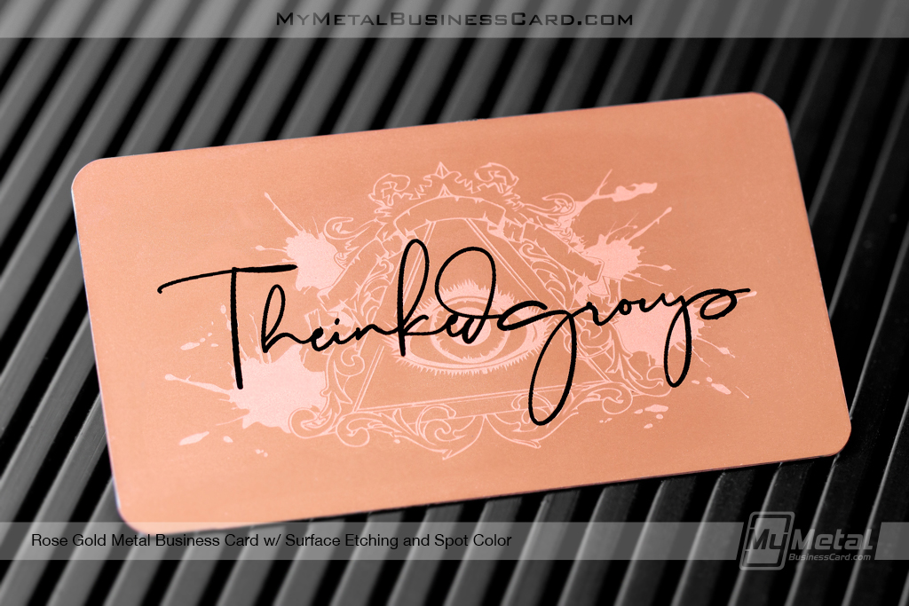
- Copper: strong warmth + quick patina; looks amazing.
Now, this won’t apply to everyone, but if your brand is “clean and modern,” stainless + matte or fine brush tends to behave best in the real world.
No matter what, a quality grade Stainless Steel is your best bet for heavy, substantial impression yet cost effective, and the longest lasting option.
Hidden details (the “second look” trick)
If your card has a secret mission, it’s that it stays on desks longer. That desk time is everything.
Ideas that work without feeling gimmicky:
- Frosted or Prism etching create a unique texture that catches light to shimmer
- Plating: A black or gold card really sets the premium look
- A pattern that resolves into your mark only under raking light
- A tiny “maker’s mark” style stamp (I’m biased; this always feels classy)
Look, don’t hide the basics. Hide the delight. The name and how to reach you should be effortless.
Durability without bulk (because wallets are unforgiving)
This is where a lot of metal cards fail. They go too cheap with a material like aluminum that bends easily, and then the recipient can’t actually carry it without getting damaged. So it becomes a desk ornament… until it becomes clutter.
A practical spec mindset helps:
- Rounded corners reduce pocket snagging and edge wear.
- Credit card thickness at .7mm feels like a platinum card
- Material Matters; stainless steel has the weight, durability and feel you want.
If you want it kept, it needs to live in the same ecosystem as real wallets and cardholders. Sexy, yes. Usable, more yes.
Readability: metal punishes bad typography
On paper, low contrast can look “elegant.” On metal, it often looks like a manufacturing error.
A quick hierarchy that survives bad lighting:
- Name: big enough to read at arm’s length
- Role: slightly smaller, still clear
- One contact line people actually use (email or phone)
- QR that doesn’t scream, but scans reliably
Laser etching and engraving catch light differently, so you test under:
- overhead office lighting
- warm restaurant lighting
- daylight near a window
If it fails any of those, it’s not “minimal.” It’s just hard to read.
Luxury vs playful: commit, don’t compromise
Hot take: “Luxury + playful” usually becomes “confused.”
Luxury metal cards win by restraint: spacing, precision, controlled surfaces. Playful cards win by surprise: shapes, color pops, witty microcopy. Mixing the two can work, but only if you have a strong brand system already. If you don’t, your card becomes a personality crisis in someone’s pocket.
In my experience, the safest winning formula is: one bold move, everything else disciplined.
Functional add-ons people don’t hate
Utility can turn a card into a tool, and tools get kept. Still, most “multi-tool business cards” are cringey, flimsy, or both.
Better functional ideas that don’t hijack the design:
- Discreet ruler marks on one edge (subtle, actually useful)
- QR Codes Work – list your QR and contact details. NFC fails more than people admit.
- A small notch or corner detail that makes it a bookmark without saying “I’m a bookmark”
- Magnetic backing for industries where cards end up on fridges/filing cabinets (real estate, contractors)
If the add-on needs explaining, it’s probably not worth it.
10 Creative Ways to Make a Metal Business Card a Keeper
1) Go edge-first: use a custom shape and plating
Plated cards create a unique color of metal finish like Gold, Copper, Black and Silver. Combine this with a custom shape, cut outs, or unique design to your industry for a solid win.
2) Use a “touch path” texture
Design the texture so the thumb naturally lands on your logo or name block. Physical interaction becomes guided attention. Use a texture like prism or frosted etching.
3) Build a two-stage reveal
Front: clean identity with easy contact info. Backside: Combine a solid design of your logo with Deep Etching and Frosted Etching to intrique them.
4) Make contrast do the heavy lifting
Matte Black + gold logo. Brushed Copper + black printing. The goal is legibility and drama without clutter.
5) Try cutouts sparingly (one shape, not twelve)
A single negative-space cutout can feel prestigious. Too many and it turns into a novelty keychain.
6) Do a “serial number” or limited-run edition
Not fake scarcity. Real batch numbering. It changes how people treat the object (collectible energy is real).
7) Use negative space as a feature.
Polished Gold looks great but can get gaudy, consider etching the entire background out so it’s matte gold and only your contact information is in the shiny, mirror polished look.
8) Put the QR where it doesn’t ruin the front
Back corner. Bottom edge zone. Even a silver laser etched QR can work if you keep it scannable and high-contrast.
9) Shape it for your industry, but keep it pocketable
Rounded rectangle is safe. A subtle corner chamfer or asymmetric curve can be enough to feel custom without being a carry problem.
10) Finish with a coating that respects reality
Fingerprint resistance, scratch resistance, corrosion resistance. Glam finishes that degrade quickly kill the “premium” story fast.
Production tips (the part that decides everything)
If you’re serious about keepability, you treat manufacturing like brand protection.
- Ask suppliers for tolerance specs and real samples, not just renders.
- Specify custom shapes (sharp edges are a silent dealbreaker, get rounded corners).
- Demand consistency across batches if you’re using plated color.
- Choose engraving depth and method based on wear. Surface marks fade; deeper cuts stay readable.
And yes, eco-friendly materials can be a differentiator, but don’t let “eco” become an excuse for a finish that scratches if someone looks at it wrong.
The actual goal
A kept card isn’t just memorable. It’s revisited and displayed with pride. “Look what he gave me”
Design for touch, for light, for pockets, for repetition. If the card feels intentional every time someone picks it up, you won’t need to “follow up” as aggressively, because your brand already stayed behind.