
Clear restroom signs help people move through public places with ease and comfort. A well-made sign gives direction without stress and supports people of all abilities. When a space uses thoughtful design, visitors feel respected and safe. Bathroom signs may seem small, yet they play an important role in daily experiences.
Many facilities depend on ada bathroom signs to support access needs and follow proper guidelines. These signs help people with vision limits, physical challenges, or temporary conditions. They also help families, caregivers, and visitors who want quick and clear guidance. This article will explain the main features that make a bathroom sign accessible and useful for everyone.
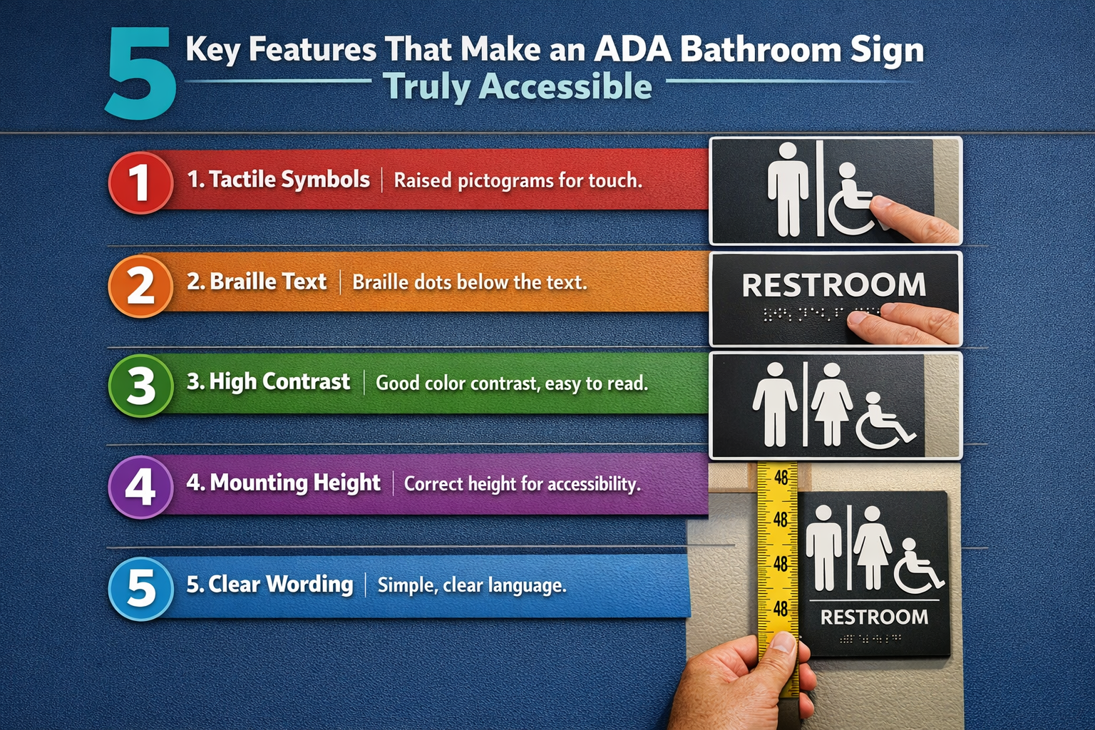
1. Raised Letters and Braille That Support Touch Reading
Raised text and braille give access to people who read by touch. These features allow users with vision loss to identify restrooms without help. The letters must rise clearly from the surface so fingers can trace them with ease. Braille dots also need correct spacing to support smooth reading.
Designers usually place braille below the main text in a standard layout. This placement helps users know where to touch without delay. Smooth edges protect hands and improve comfort. When raised text follows size and spacing rules, users feel confident and independent in shared spaces.
2. Strong Color Contrast for Clear Visibility
Color contrast helps people read signs quickly and without strain. A clear difference between text and background supports users with low vision. Dark text on a light surface or light text on a dark surface works best. This contrast allows fast recognition from several feet away.
Lighting also affects how signs appear. A soft, non-glossy finish reduces glare from overhead lights. Clear contrast keeps the message readable during the day and night. When designers focus on visibility, restroom signs serve a wider audience with ease.
3. Correct Height and Wall Placement
The height and position of a restroom sign matter as much as its design. Signs must sit where people using wheelchairs can reach them. Most standards place signs on the wall next to the door, not on the door itself. This location helps users find the sign even when the door stays open.
Clear placement also prevents obstacles in walkways. Signs should not hide behind decorations, sinks, or hand dryers. When signs stay in expected locations, visitors move through the space with less effort.
4. Clear Symbols That Send a Quick Message
Simple symbols help users understand restroom access without reading long text. Universal icons guide people who speak different languages or read slowly. These symbols also help children and visitors who prefer visual cues.
Designers must use clean shapes and familiar forms. Extra detail can distract from the message. Symbols should match the size of the text and remain easy to see. When paired with words, symbols create balance and clarity.
5. Strong Materials That Last Over Time
Bathroom signs face daily use and regular cleaning. Strong materials help signs stay clear and readable for years. Quality surfaces resist fading, moisture, and scratches. This durability keeps raised letters and braille easy to read.
Smooth finishes allow staff to clean signs without damage. Long-lasting materials also reduce the need for replacement. During updates or renovations, ada bathroom signs made with durable materials offer long-term value. Clear signs that last help maintain a welcoming environment for every visitor.
Accessible bathroom signs support comfort, safety, and independence in public spaces. Each feature, from raised text to proper placement, helps people move with confidence. When designers focus on clarity and quality, restroom areas become easier to use for all visitors. Thoughtful sign design reflects care, respect, and a strong commitment to inclusive spaces.